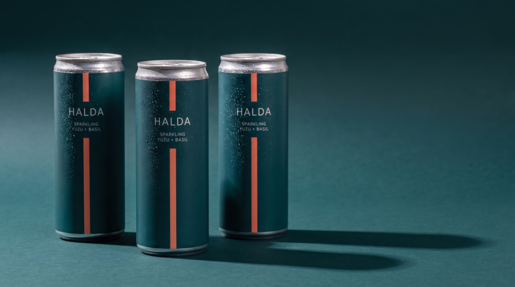
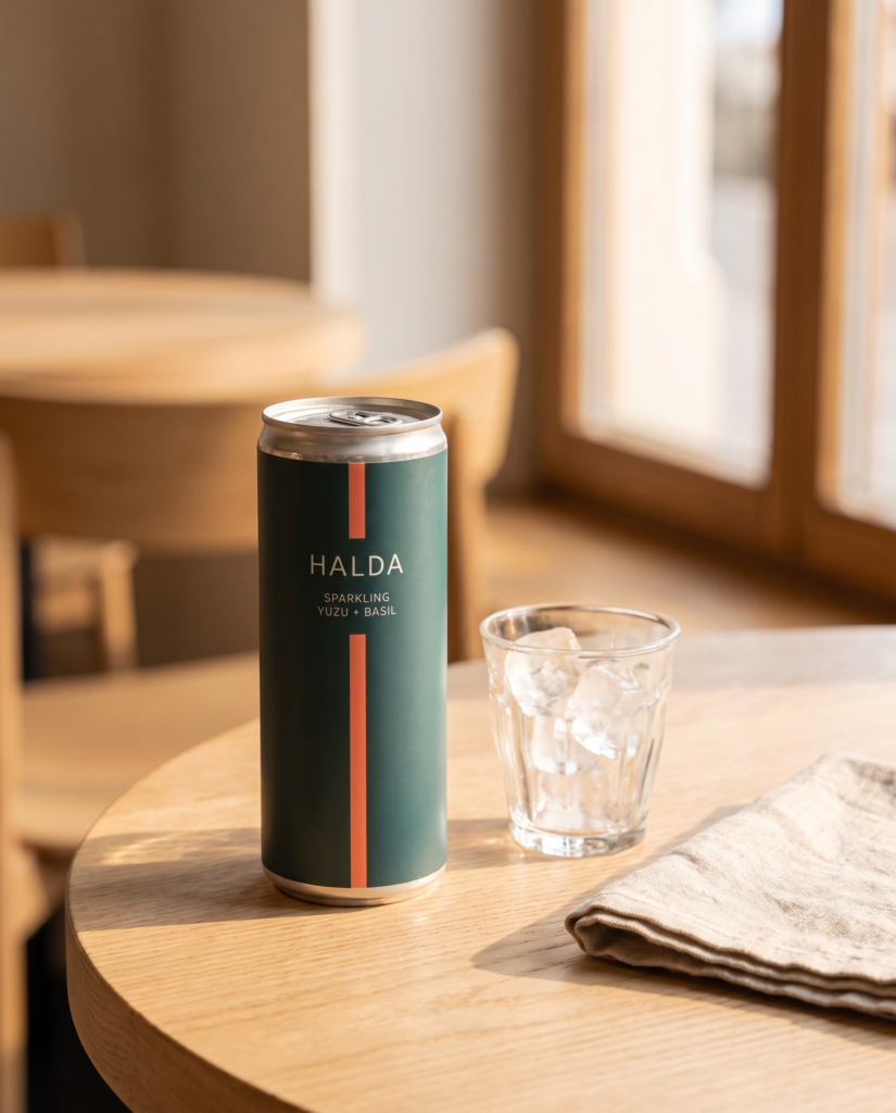
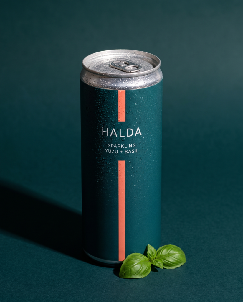
Overhead flat lay with ingredients
Straight down, even light, and every object earning its place. Negative space left for a caption.
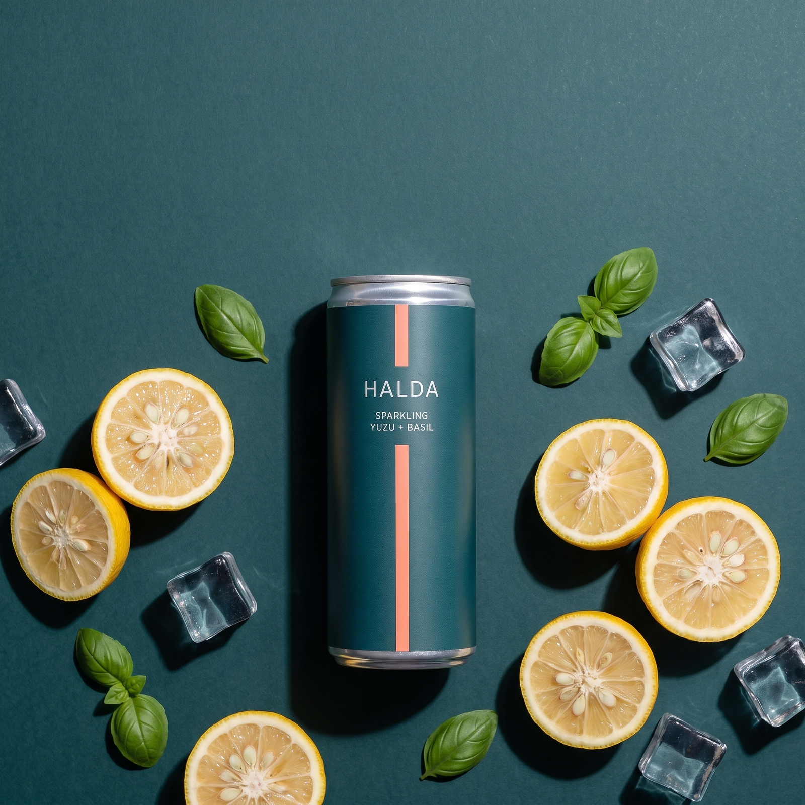
Straight down, product lying flat, everything arranged around it. The overhead flat lay is the most forgiving composition in product photography and the easiest one to get wrong.
Forgiving, because there is no perspective to manage and no background to build. Easy to get wrong, because with nothing but arrangement to look at, every object has to earn its place. Ingredients say what is in the product. Ice says how it is served. A prop that says neither is clutter.
Even, diffused light from above. Directional light in a flat lay throws long shadows across the arrangement and turns a clean grid into a mess.
The negative space at one edge is deliberate. A flat lay filled to all four corners has nowhere for type to go, and this composition is usually commissioned for a feed post that needs a caption burned in.
The honest note on this one
This frame is styled with lemons. The product is a yuzu drink, and yuzu is smaller, bumpier and more yellow-green. It is a factual error in the styling, it is exactly the kind of thing a client in a food or drink category notices immediately, and it is left visible here rather than quietly reshot because the point of this library is to show how direction is checked, not to pretend it never fails.