Golden hour vertical with headline space
Warm low sun behind a cool product, composed for a phone and for a headline in the top third.
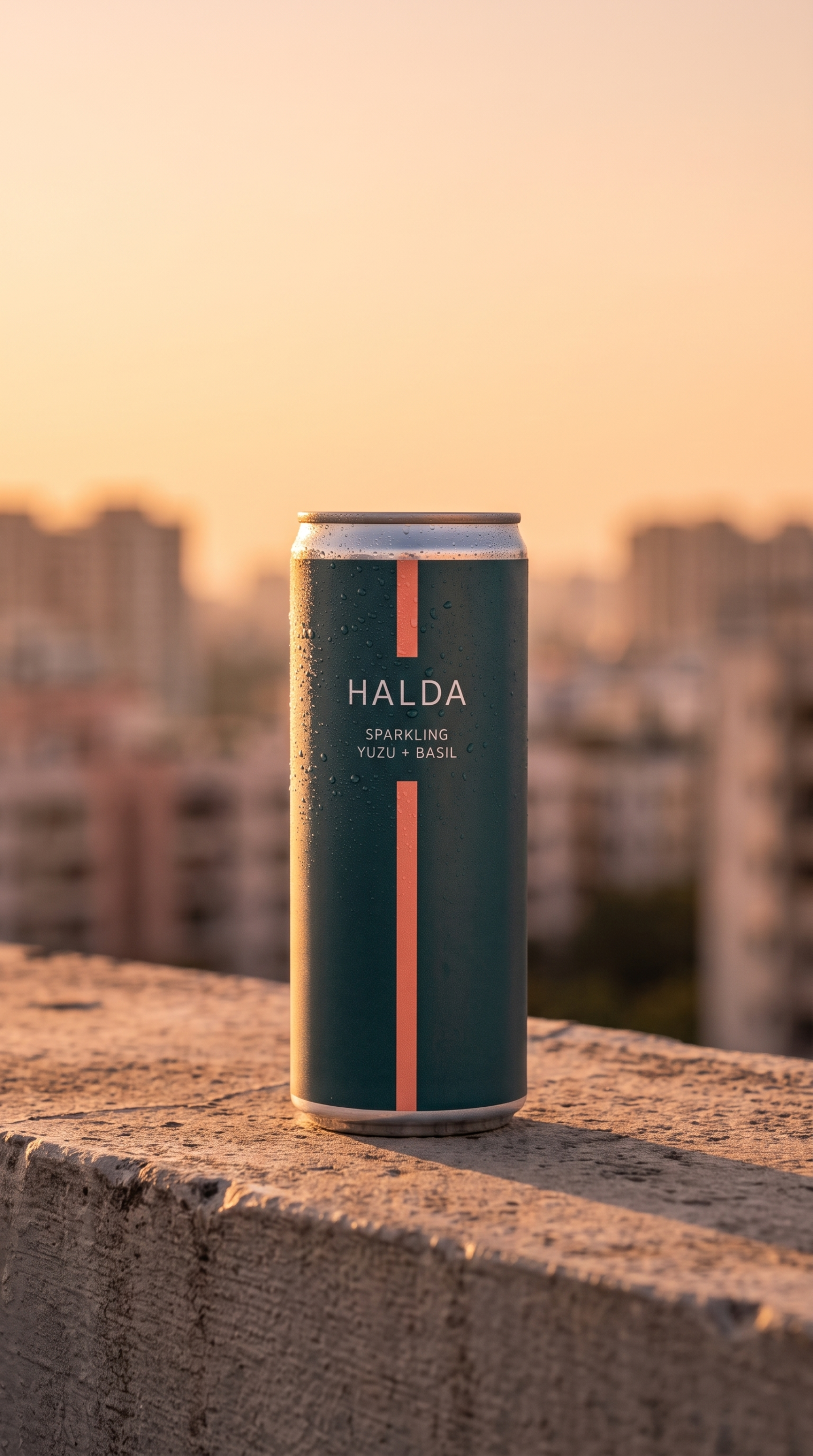
Vertical, shot at the end of the day, with the sky doing most of the work. Built for a phone screen and for a headline to sit in the top third.
Golden hour is the one lighting condition that flatters almost any product, which is exactly why it is overused. It earns its place here because the composition needs a warm field behind a cool product: the teal body separates from the amber sky without any rim light or trickery.
The product sits in the lower two thirds. That is not a compositional preference, it is a format requirement. On a vertical placement the top third is where the headline goes, and a frame that fills it is a frame the designer has to crop.
The skyline is soft enough to read as context and not as a location. A recognisable building would make the shot about a city.
What to ask for
If you want this, say the light direction and the space you need left empty, not the mood. “Golden hour” gets you a warm image. “Warm low sun from behind, product in the lower two thirds, sky clear enough for a headline” gets you an image the design team can use.